Corporate DesignWebdesignBranding
I have been working with foodlab since the very beginning and with the founder and owner Christin even long before that.
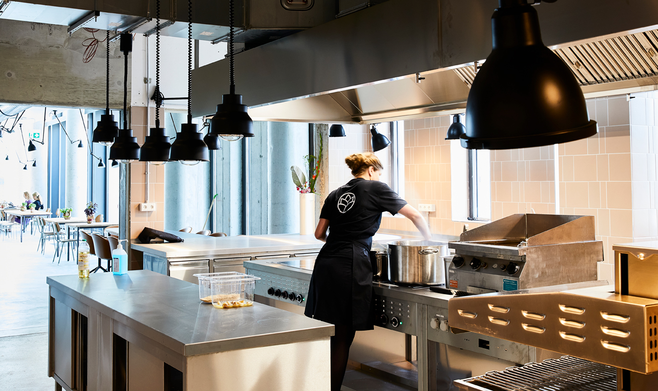
The foodlab is a creative playground for food startups and foodies, including several kitchens, co-working space, café, monthly changing pop-up restaurant, an in-house accelerator program and lots of networking opportunities.
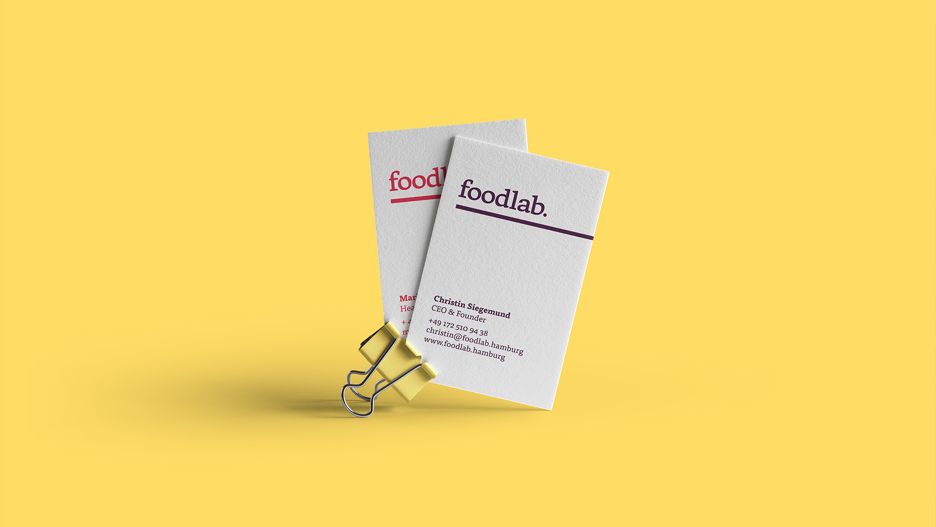
Christin built this company from scratch in 2018 and asked me to support her in everything design related. What started with a small logo idea ended up in a long year partnership with an ever growing corporate design.
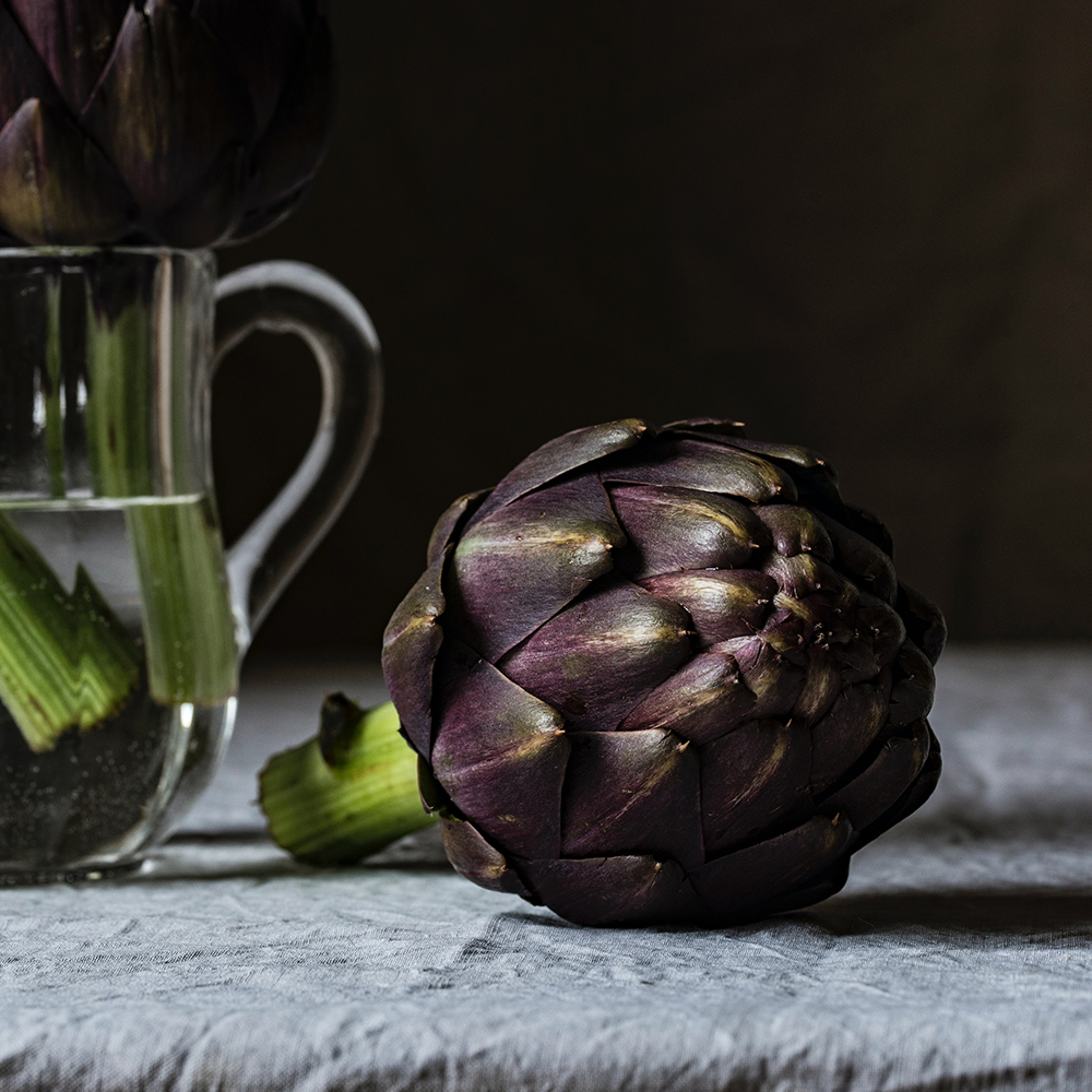
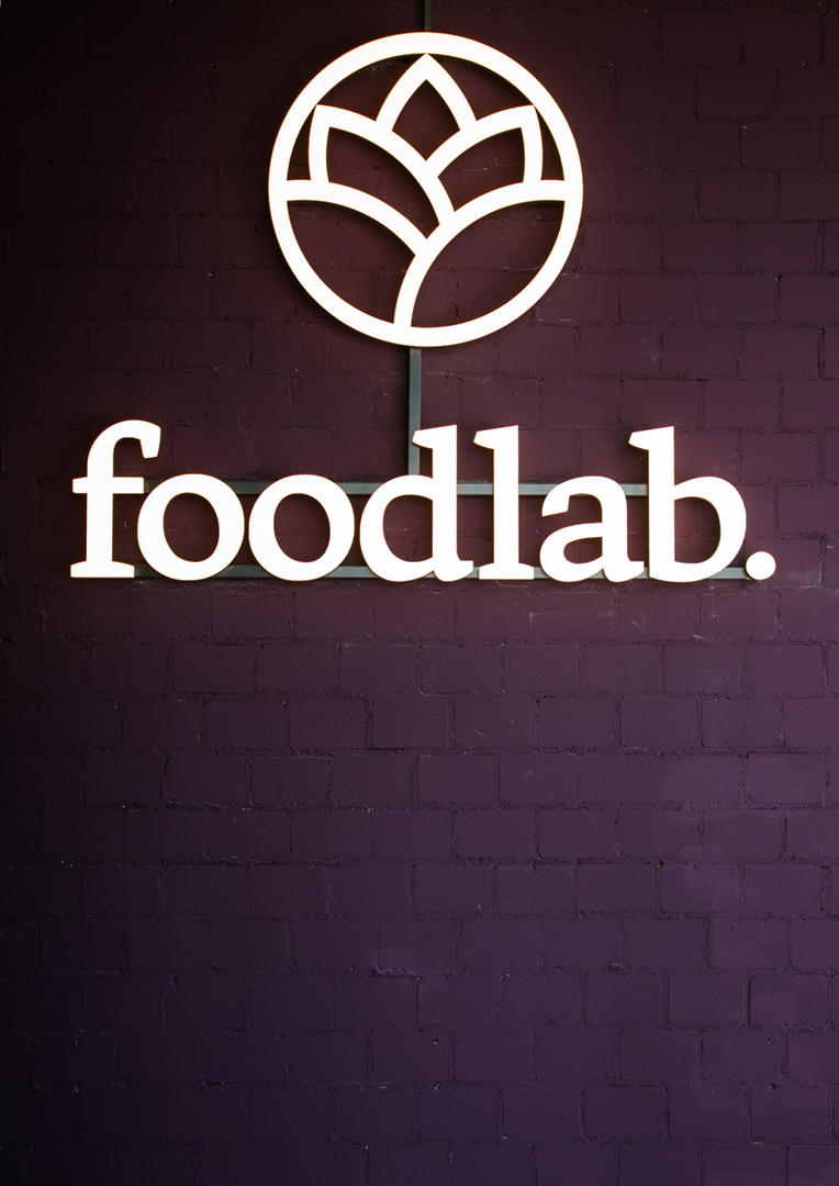
The logo is based on the shape and color of the artichoke. But since the cooks of the foodlab aren't just cooking with artichokes the whole corporate design is as colourful as the ingredients and people of the foodlab itself.
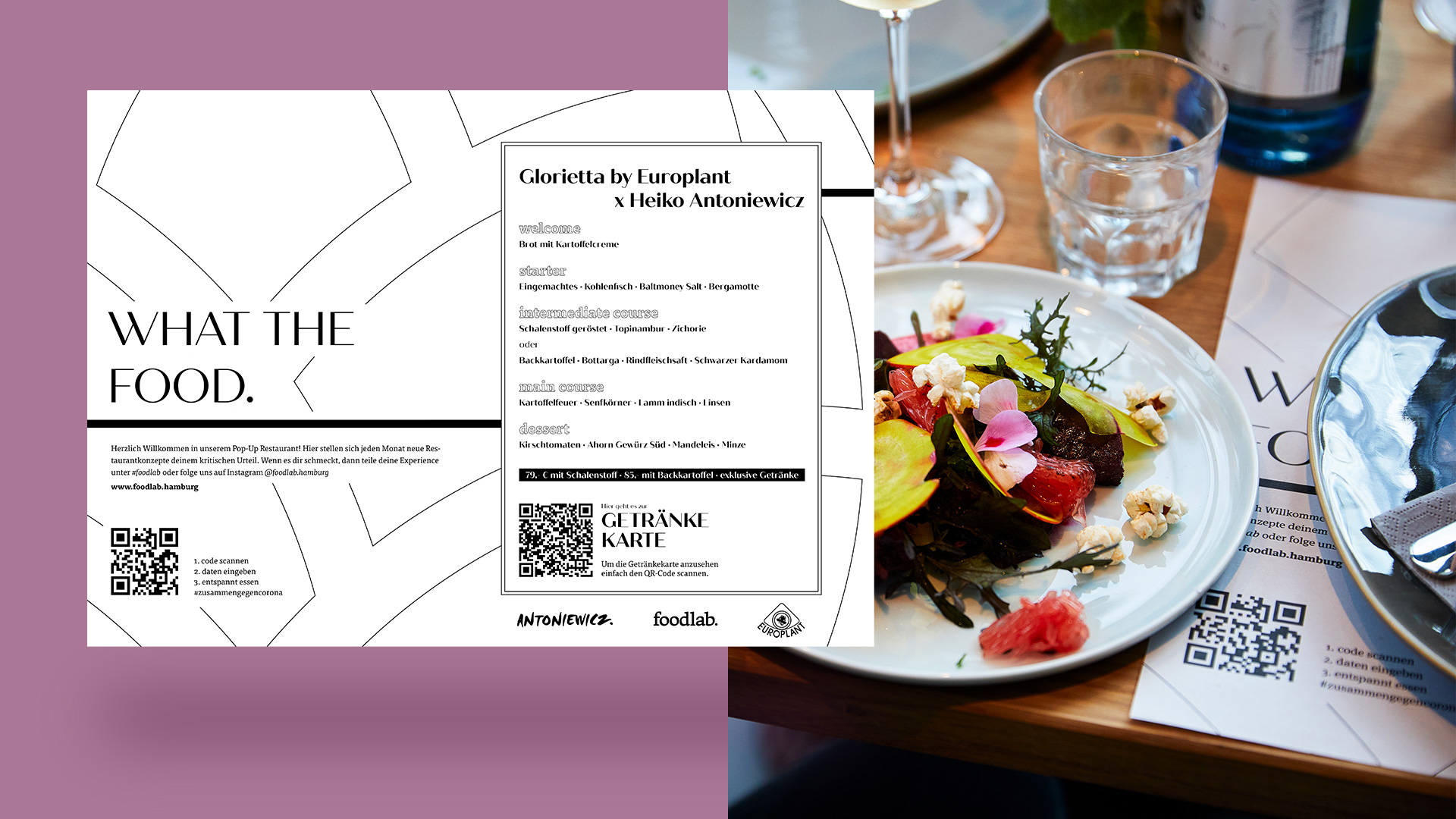
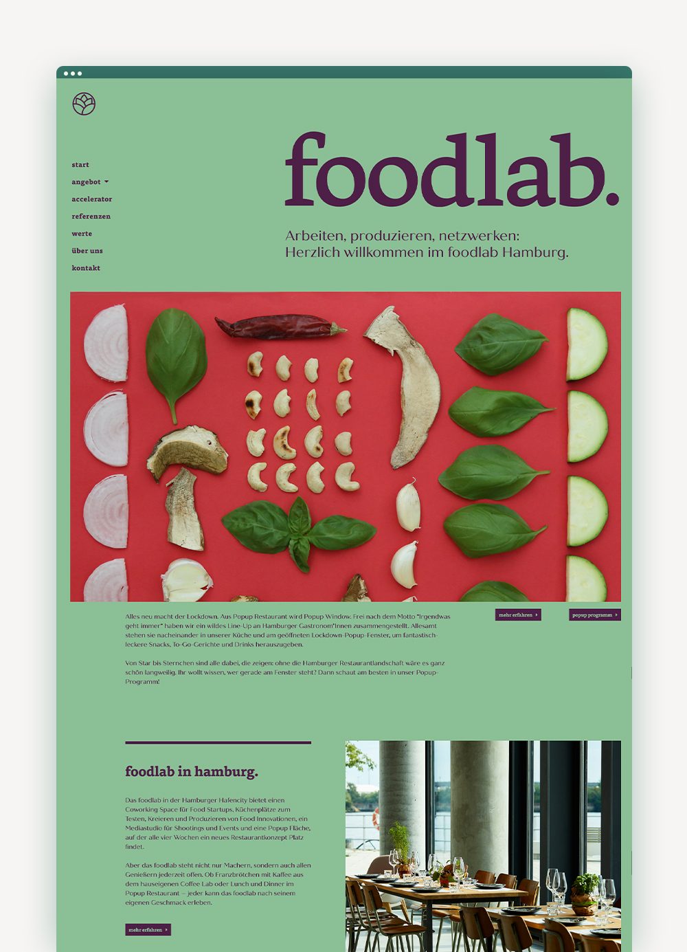
And by individual I mean "the-homepage-changes-its-colours-every-month"-individual. Depending on what kind of popup-restaurant is serving in that particular month or special event is going on we choose the colours that fits just right for that occasion. Over the years we figured out some favourite combinations but are still coming up with something new from time to time.
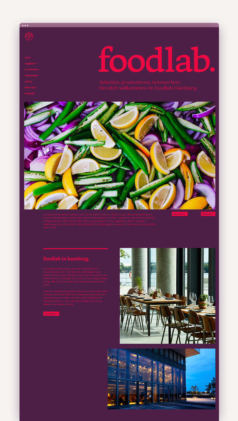
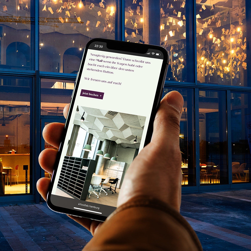
Every part of the foodlab has its own certain icon. This is used throughout our communication to support the user experience and make certain parts of the foodlab more recognizable to its guests and users.
Client:
foodlab
Freelance project
My part:
Corporate Design · Logo · Webdesign · Editorial design · Branding

Corporate DesignWebdesignBranding
I have been working with foodlab since the very beginning and with the founder and owner Christin even long before that.
The foodlab is a creative playground for food startups and foodies, including several kitchens, co-working space, café, monthly changing pop-up restaurant, an in-house accelerator program and lots of networking opportunities.
Christin built this company from scratch in 2018 and asked me to support her in everything design related. What started with a small logo idea ended up in a long year partnership with an ever growing corporate design.
The logo is based on the shape and color of the artichoke. But since the cooks of the foodlab aren't just cooking with artichokes the whole corporate design is as colourful as the ingredients and people of the foodlab itself.


And by individual I mean "the-homepage-changes-its-colours-every-month"-individual. Depending on what kind of popup-restaurant is serving in that particular month or special event is going on we choose the colours that fits just right for that occasion. Over the years we figured out some favourite combinations but are still coming up with something new from time to time.


Every part of the foodlab has its own certain icon. This is used throughout our communication to support the user experience and make certain parts of the foodlab more recognizable to its guests and users.
Client:
foodlab
Freelance project
My part:
Corporate Design · Logo · Webdesign · Editorial design · Branding
Vincent Oswald
© Vincent Oswald 2025
Vincent Oswald
© Vincent Oswald 2023