Corporate DesignWebsiteEditorial design
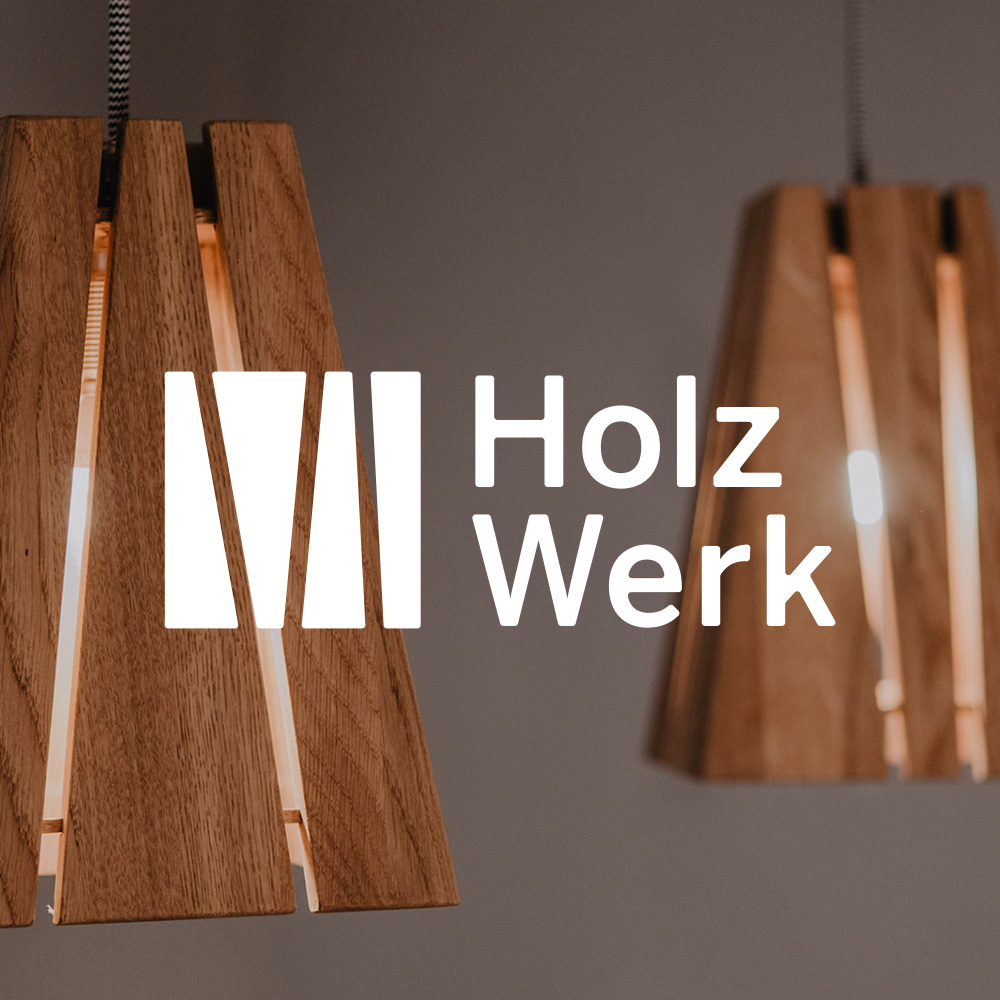
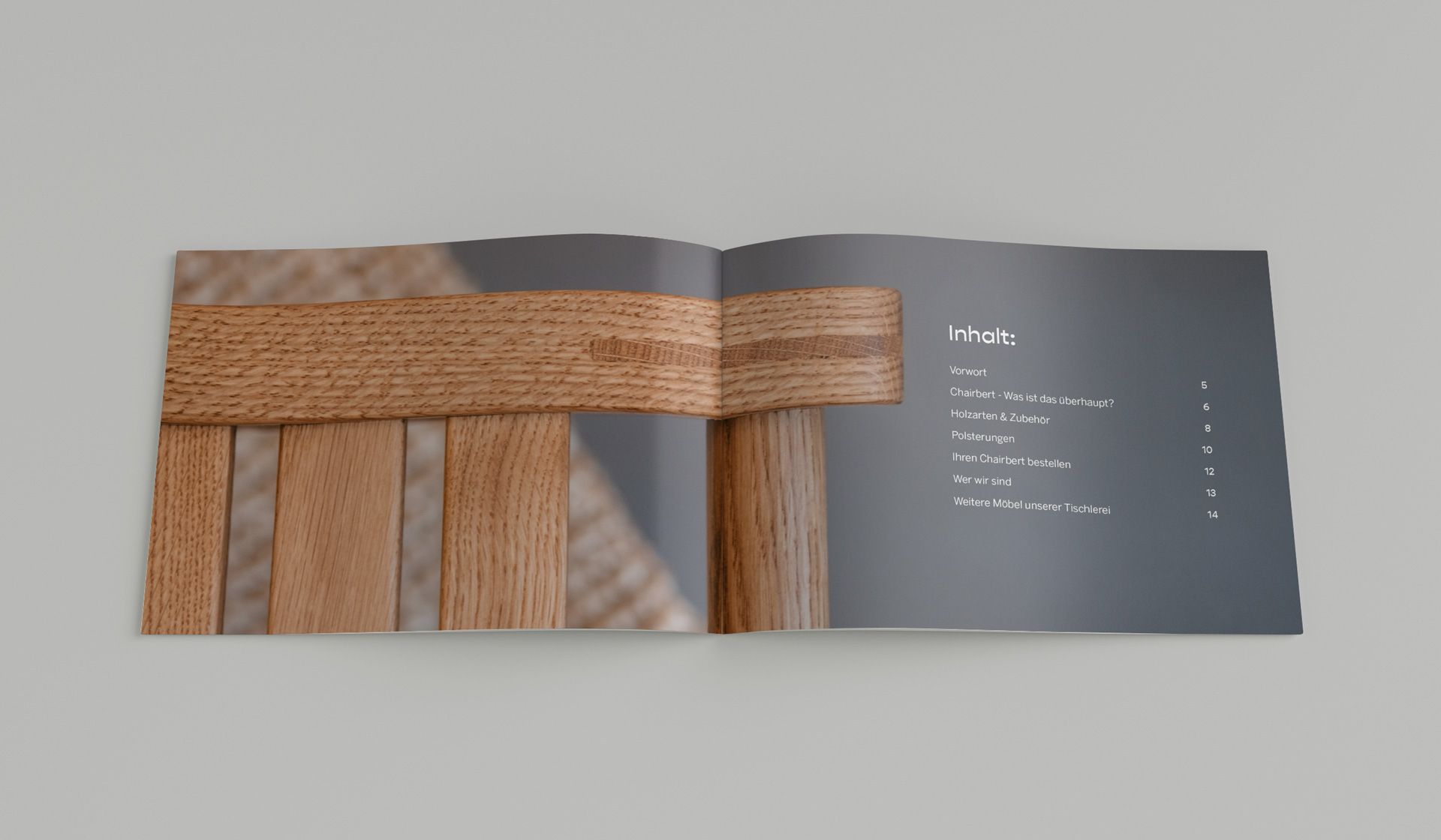
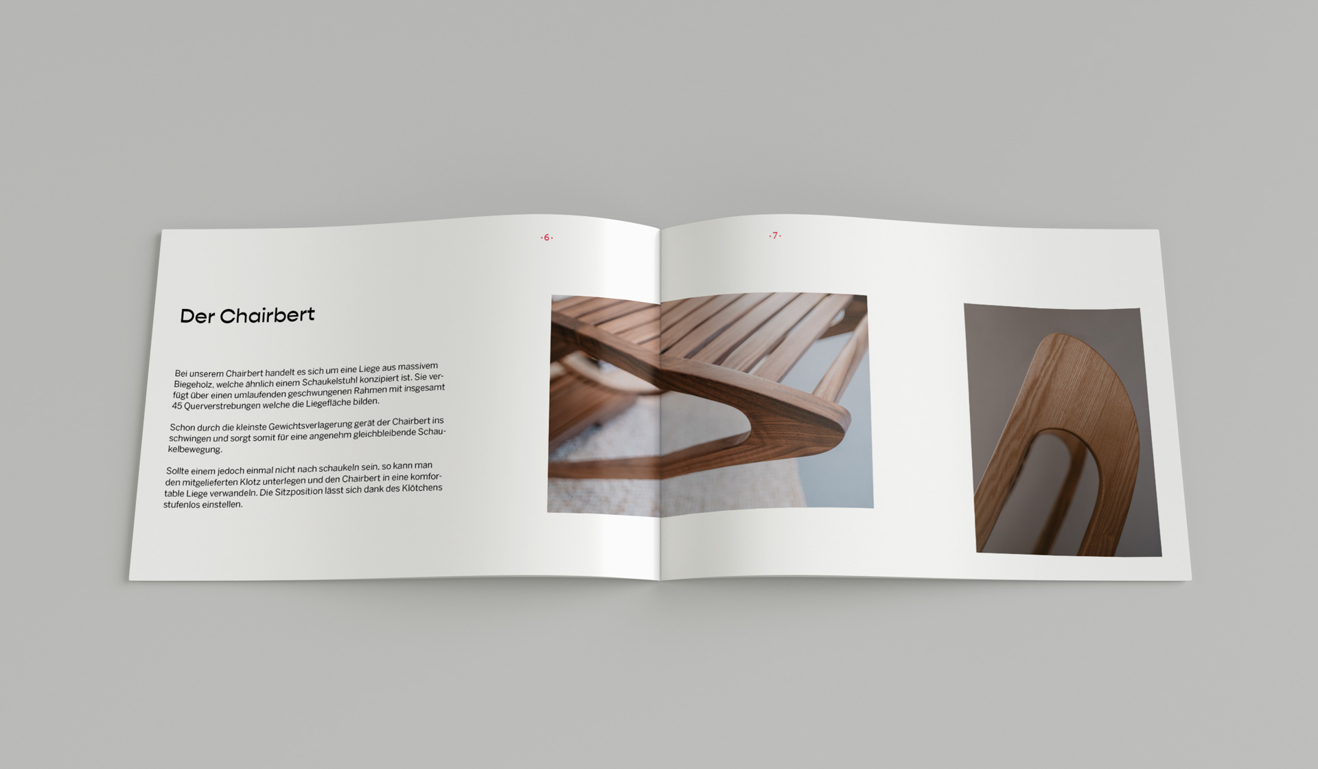
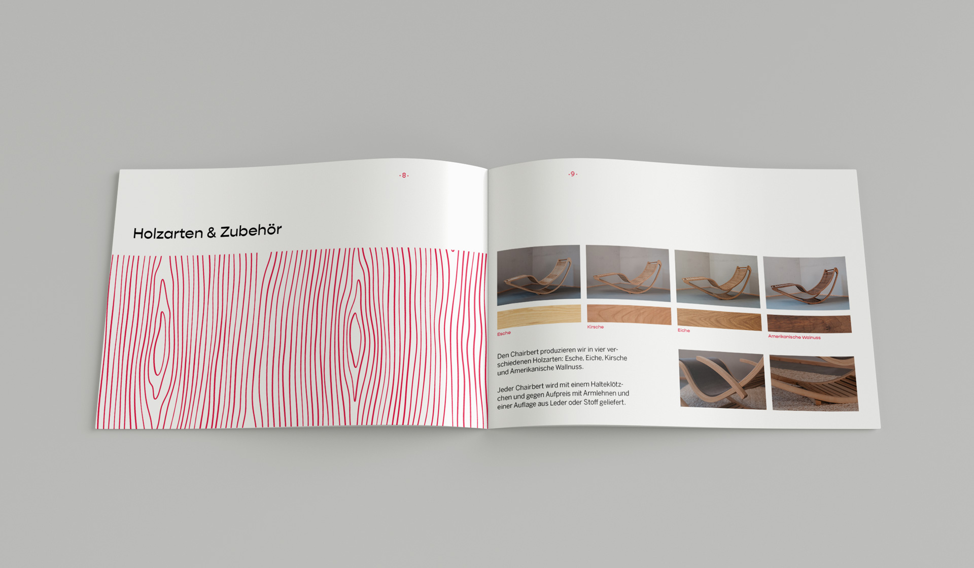
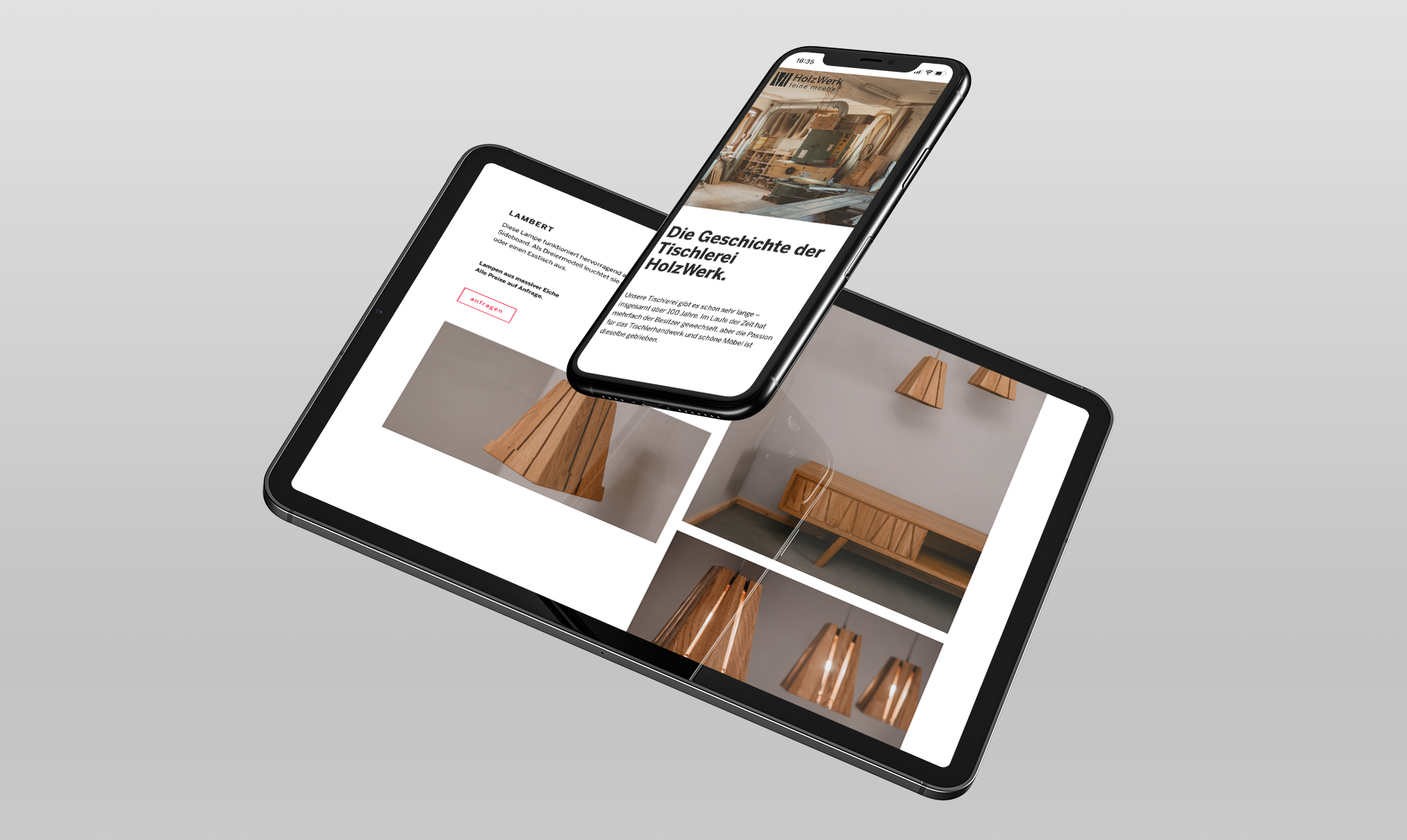
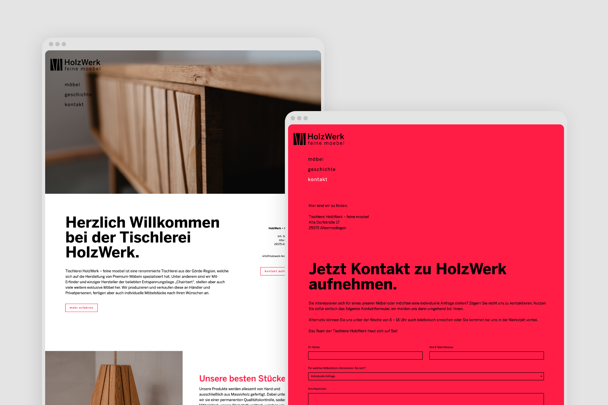
"HolzWerk – feine möbel" is a carpentry shop from my home town and its owner Sebastian happens to be my neighbor. During the pandemic his business had a rough time like so many other small businesses as well. So we agreed that I will help him out with a new corporate design and website to push his sales and to increase his visibility. In return he "paid" me with some custom made furniture.
The result: both of us are happy and his sales went back up after the release of his website. Also he got some nice feedback from his clients and people around for the new look of his business.
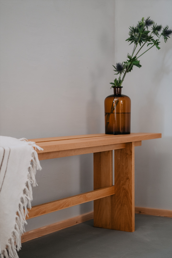

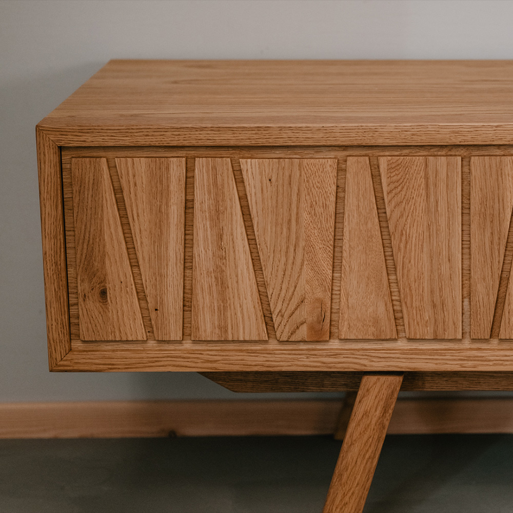
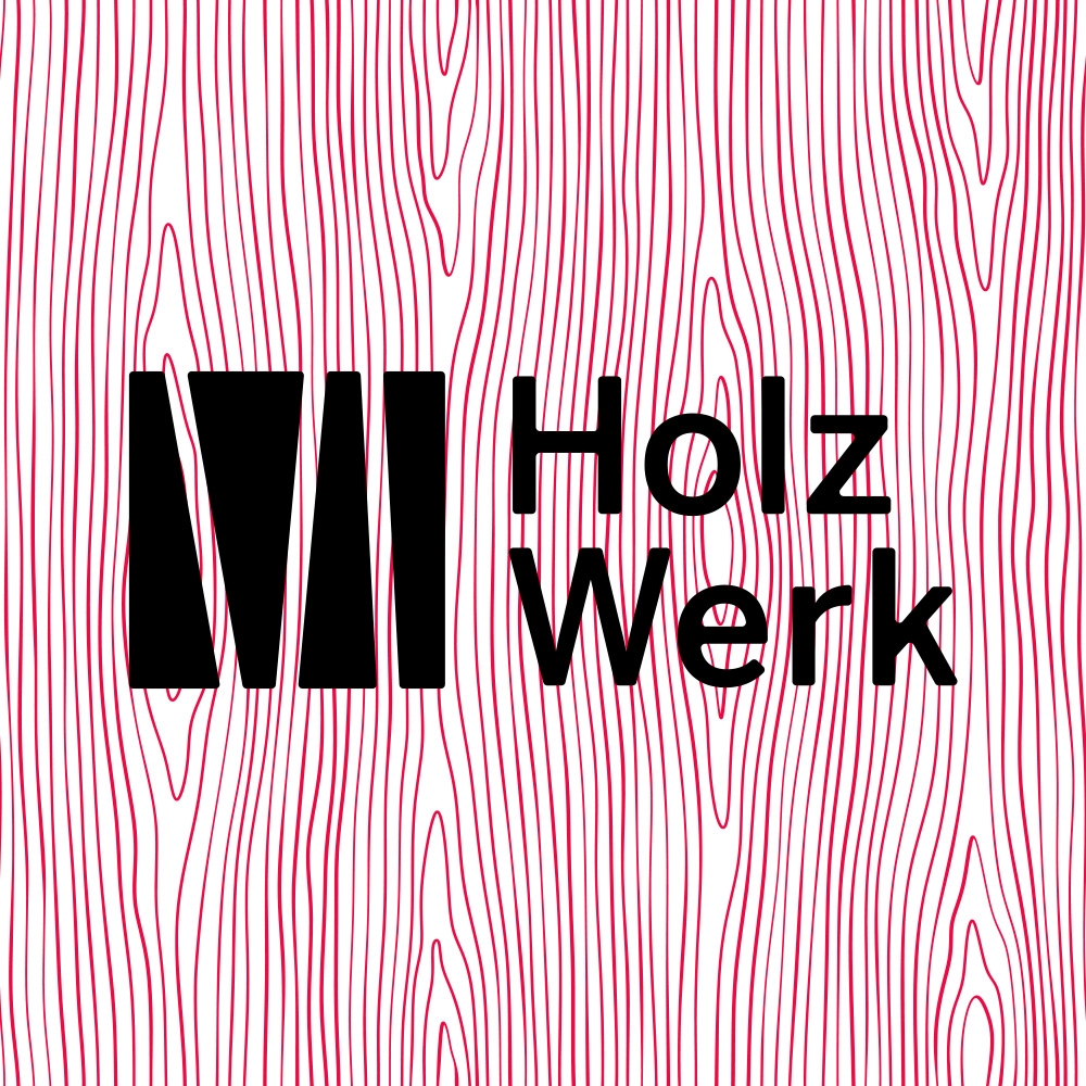
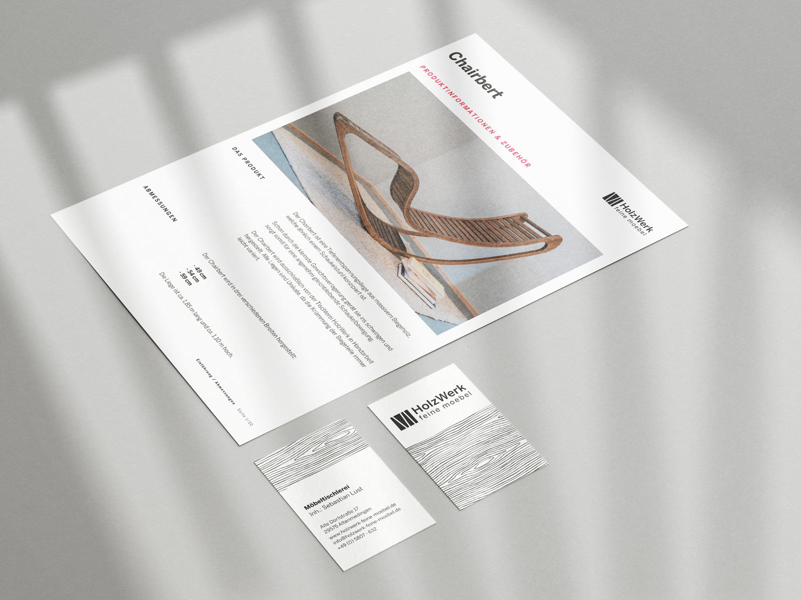
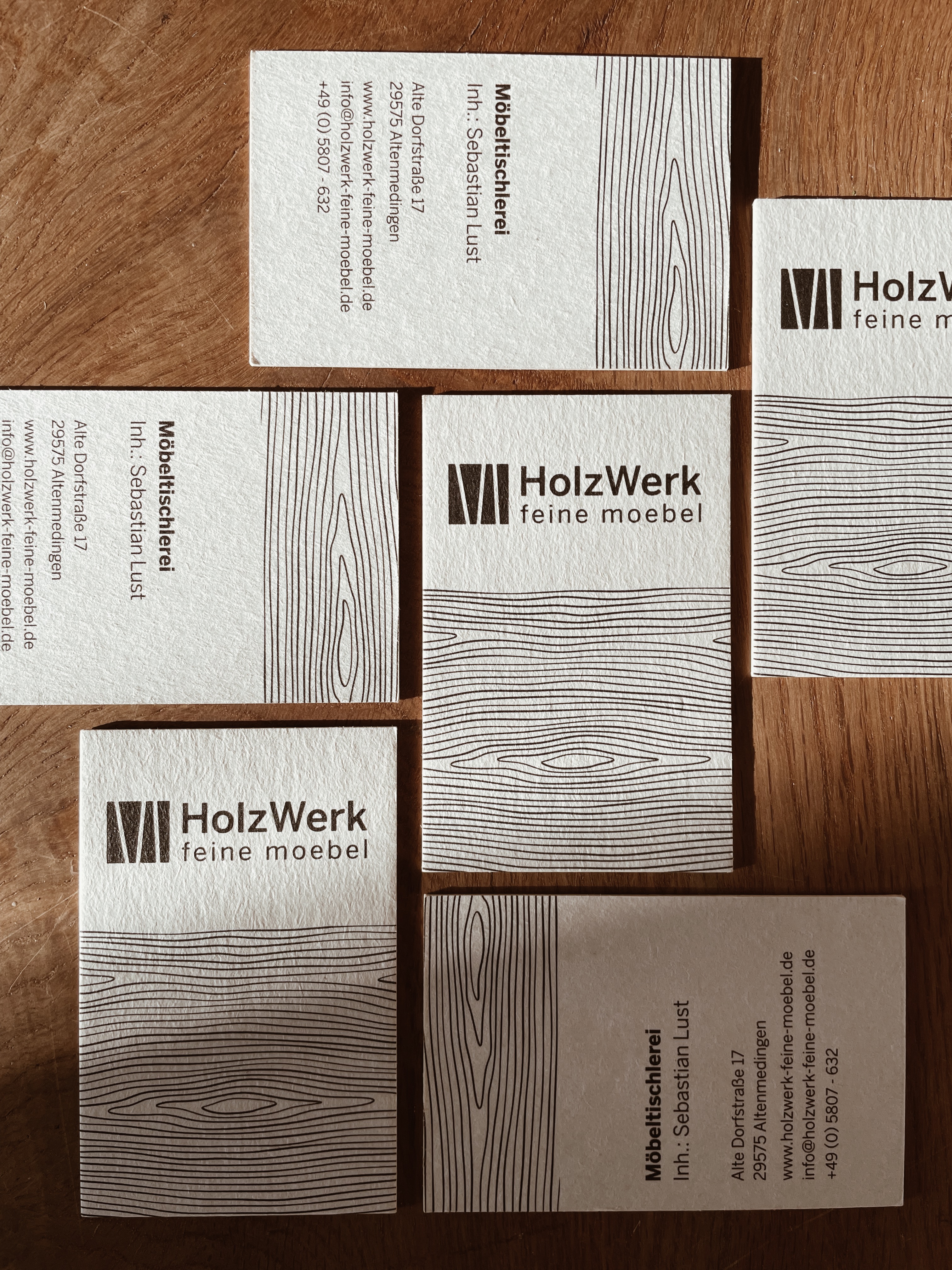
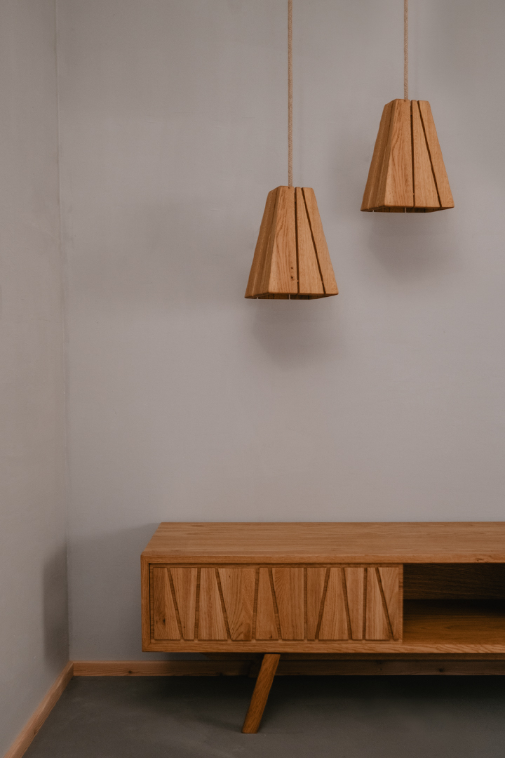
Sebastian has a certain pattern that he partly uses in his furniture as a decorative element. Like, for example, in the sideboard in the picture above. This pattern is very memorable and unique and ensures that you recognize his furniture at first sight. I have stylized this pattern and implemented it as his logo.
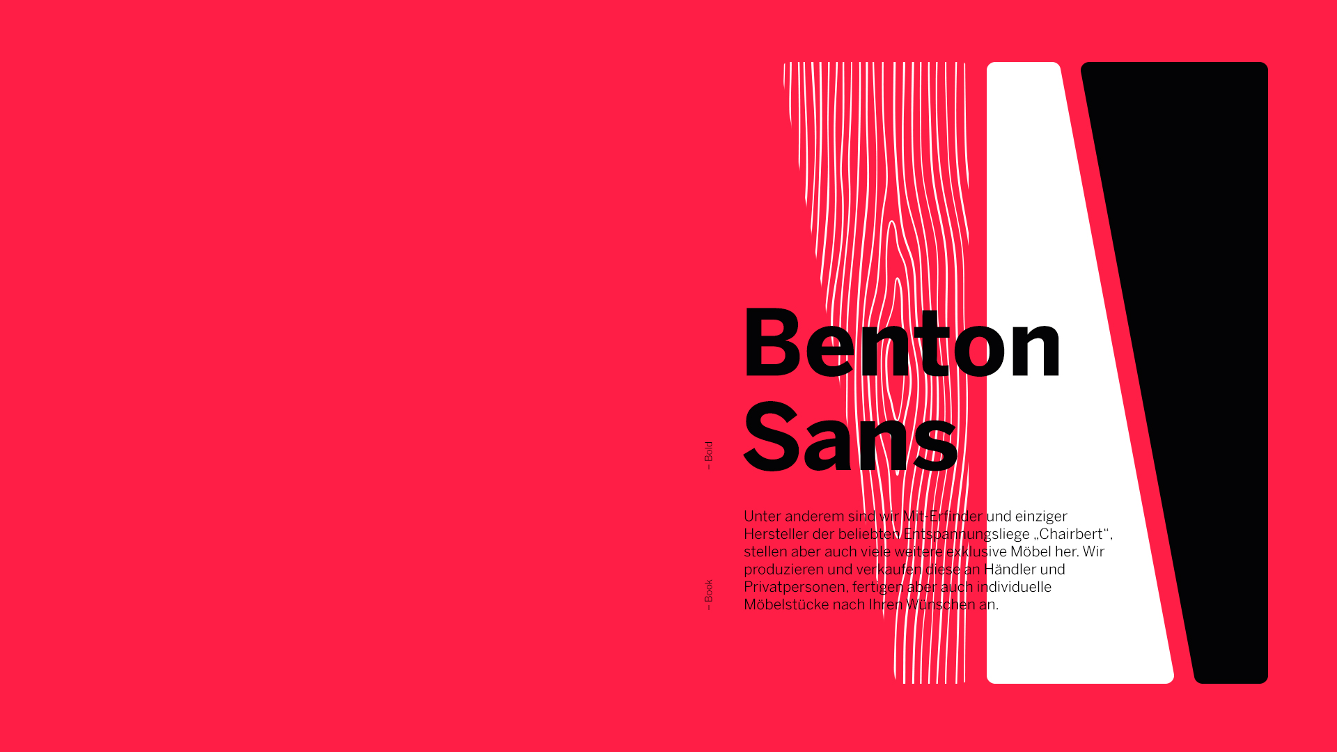
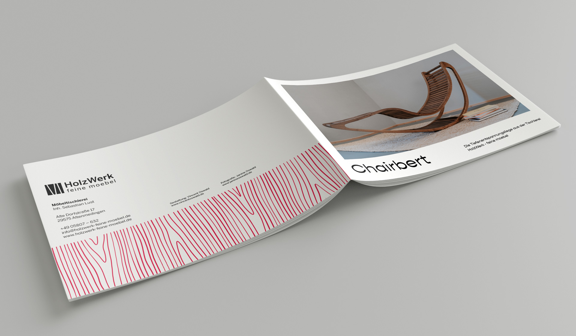
As a former punk, red was the only color Sebastian would have accepted in his corporate design. Thus, his corporate design gets another personal touch and at the same time clearly stands out from the competition.
I chose Benton Sans as his brand font, which provides good legibility in all font sizes and fits well with the rest of the corporate design.
Client:
HolzWerk – feine möbel
Freelance project
Photography:
Janine Oswald
My part:
Concept · Corporate design · Webdesign · Development · Editorial design

Corporate DesignWebsiteEditorial design
"HolzWerk – feine möbel" is a carpentry shop from my home town and its owner Sebastian happens to be my neighbor. During the pandemic his business had a rough time like so many other small businesses as well. So we agreed that I will help him out with a new corporate design and website to push his sales and to increase his visibility. In return he "paid" me with some custom made furniture.
The result: both of us are happy and his sales went back up after the release of his website. Also he got some nice feedback from his clients and people around for the new look of his business.


Sebastian has a certain pattern that he partly uses in his furniture as a decorative element. Like, for example, in the sideboard in the picture above. This pattern is very memorable and unique and ensures that you recognize his furniture at first sight. I have stylized this pattern and implemented it as his logo.

As a former punk, red was the only color Sebastian would have accepted in his corporate design. Thus, his corporate design gets another personal touch and at the same time clearly stands out from the competition.
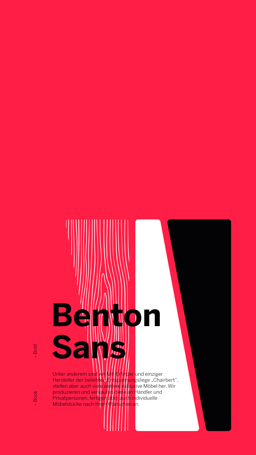
I chose Benton Sans as his brand font, which provides good legibility in all font sizes and fits well with the rest of the corporate design.


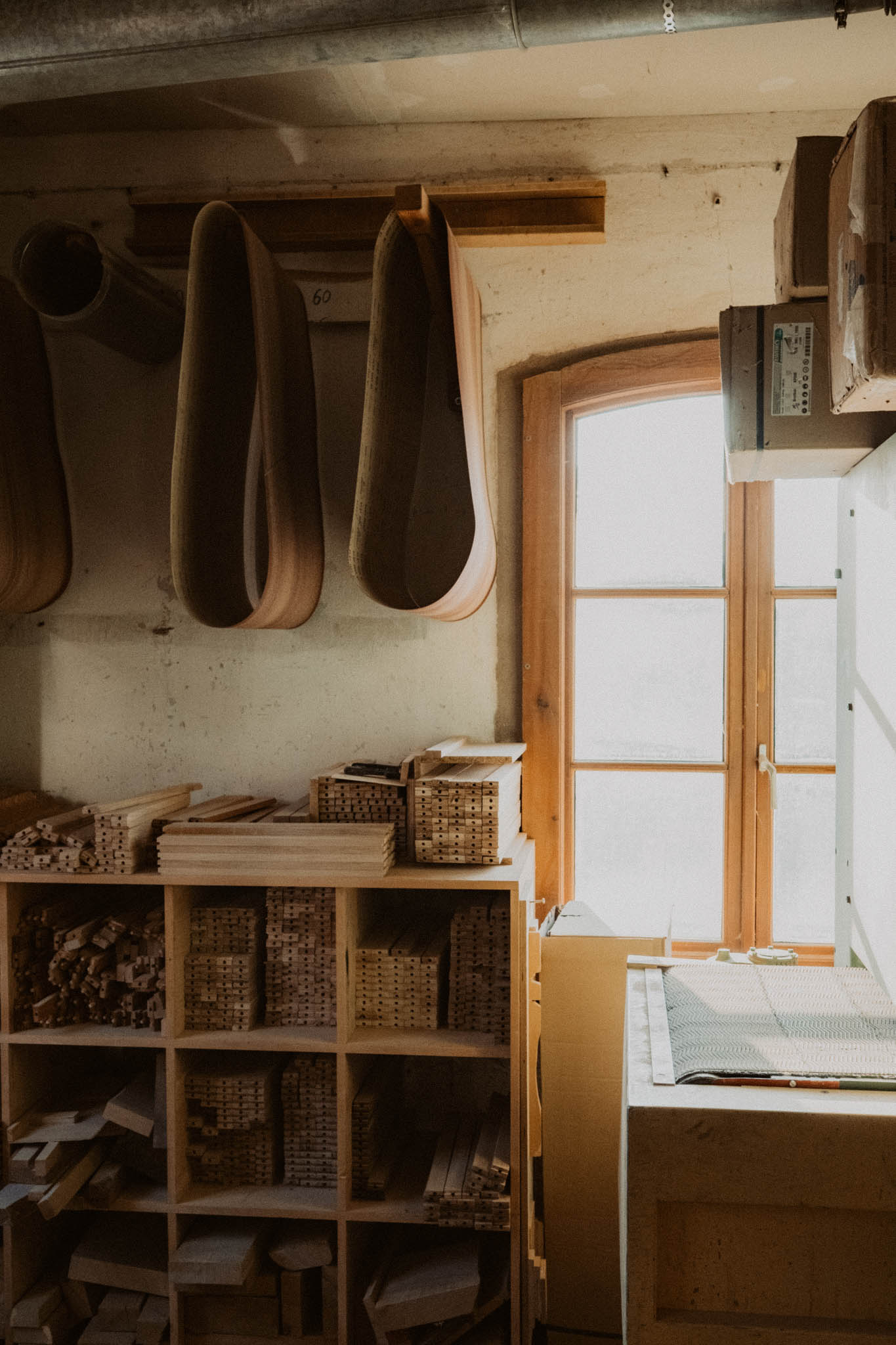
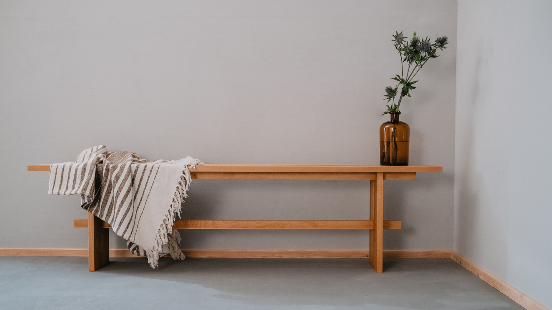
All images are taken once again by my wife and photographer Janine Oswald.


Client:
HolzWerk – feine möbel
Freelance project
Photography:
Janine Oswald
My part:
Concept · Corporate design · Webdesign · Development · Editorial design
Vincent Oswald
© Vincent Oswald 2025
Vincent Oswald
© Vincent Oswald 2023